Complex organizations don't fail because they lack information. They fail because their information systems reflect hierarchy instead of utility. When the Office of the CEO initiated a full security infrastructure upgrade, the resulting mandate to consolidate 349 intranet sites into one wasn't a technical problem — it was a strategic opportunity to fundamentally reframe how a 30,000-person organization communicates, operates, and scales.
Tasked with standing up the strategy, operational capability, and execution plan for the consolidation, I began by identifying the core misalignment: the existing intranet was built to showcase organizational structure, not to serve the people navigating it. Leadership needed clarity. Employees needed utility. The platform needed to reflect both simultaneously.
I reframed the brief entirely — shifting the information architecture from a team and org chart display model to a business area and service offering model. This wasn't cosmetic. It required productizing the intranet: defining its purpose, governance structure, content lifecycle, operational model, and user experience design from the ground up.
The result went beyond the original mandate. The consolidated platform became the organizational blueprint for enterprise communications — simple enough to navigate intuitively, structured enough to scale organically, and aligned closely enough to the organization's brand and messaging standards that other teams didn't just accept it. They wanted to replicate it.
I positioned myself as the firm-wide subject matter expert on intranet architecture and became the authority on executive communications within the intranet ecosystem — a role defined not by title, but by demonstrated impact.
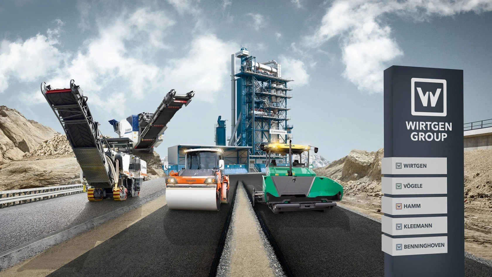
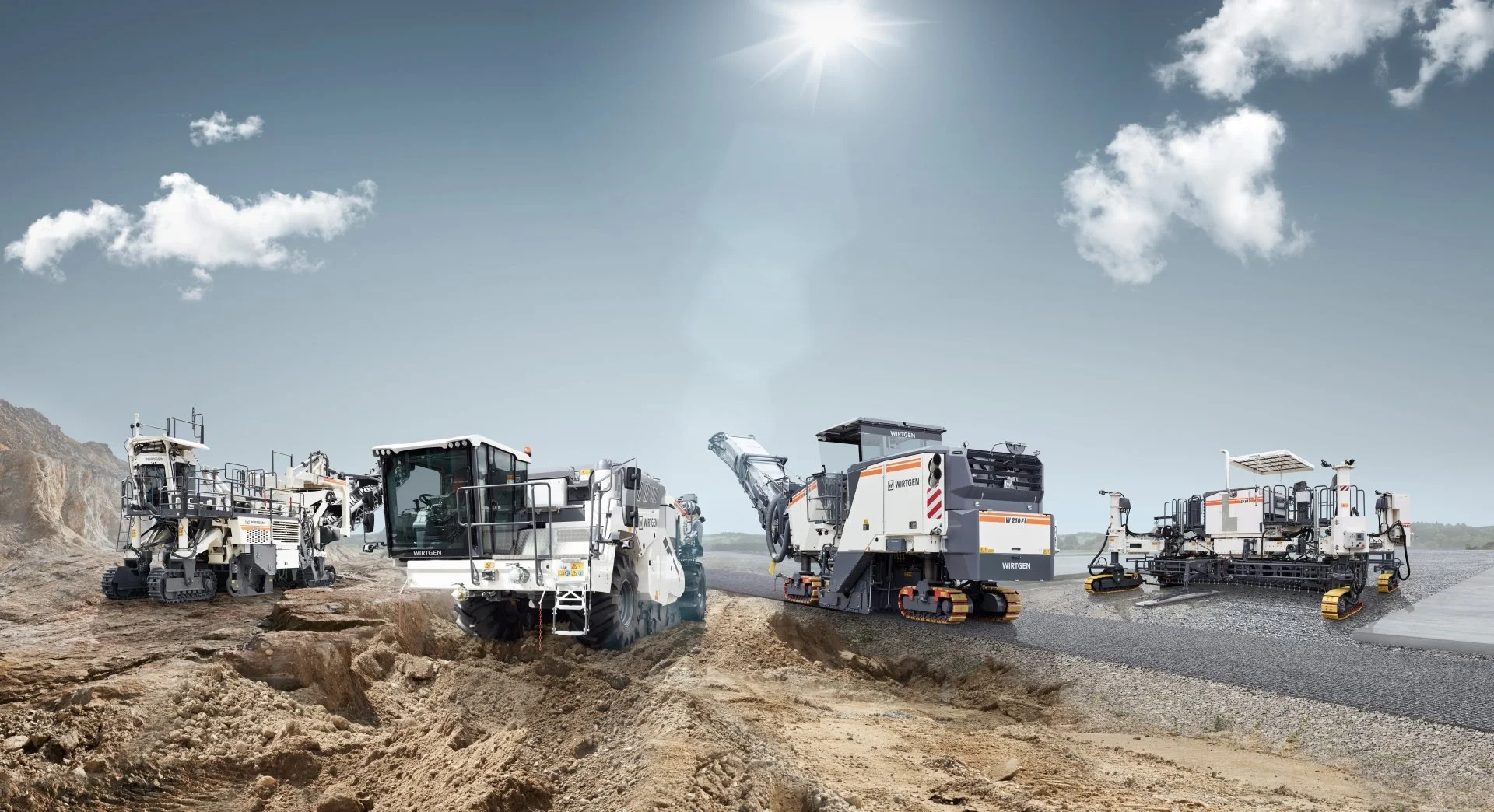
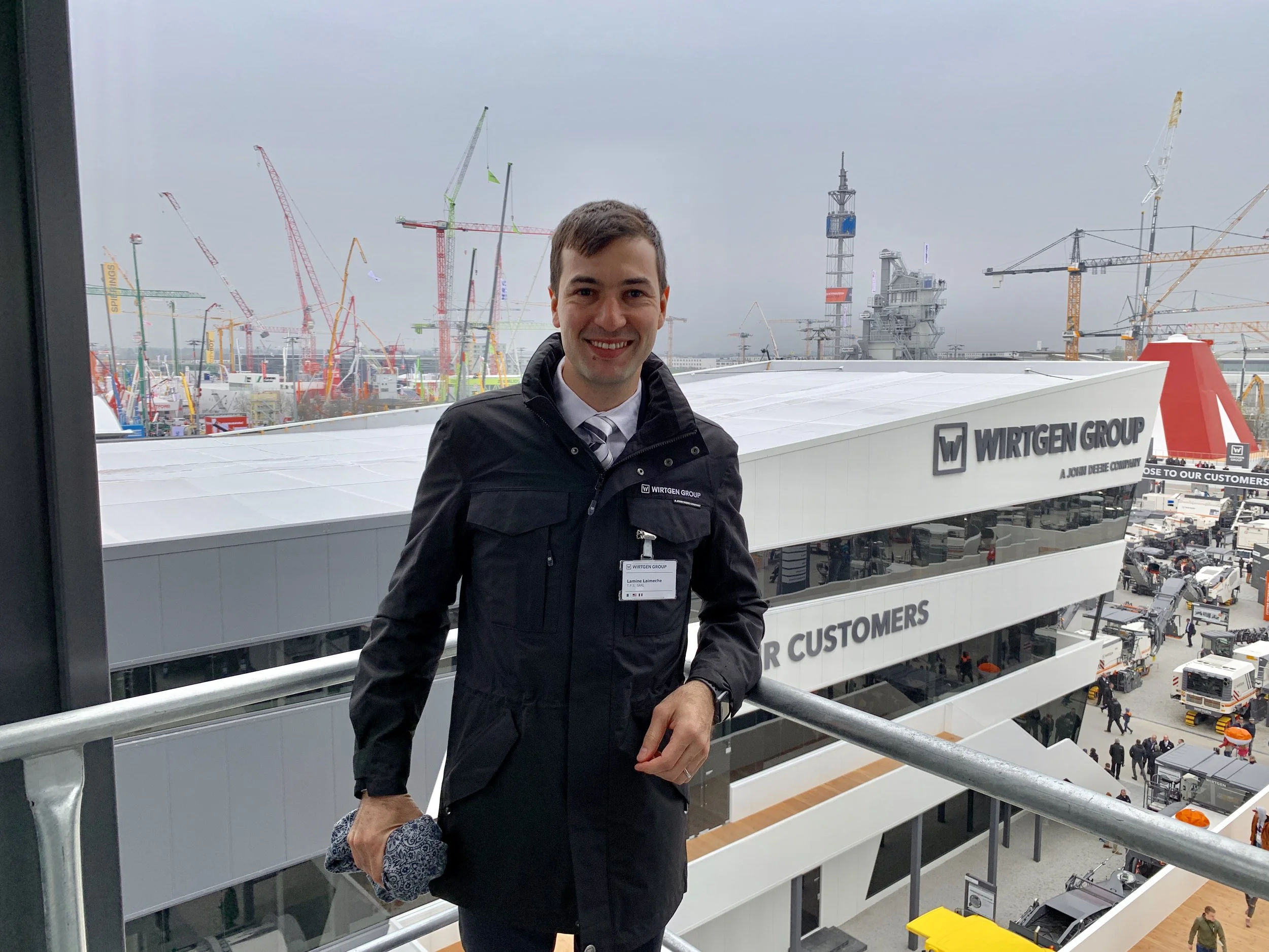
The most complex commercial environments aren't the ones where parties disagree. They're the ones where parties operate under fundamentally different assumptions about how the world works — and neither side fully understands why the other behaves the way it does. For eight years, I operated at exactly this intersection: between German manufacturing precision and the commercial volatility of North African and Middle Eastern markets.
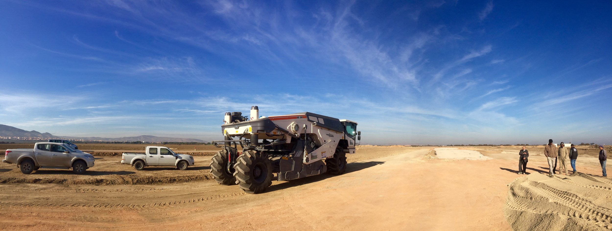
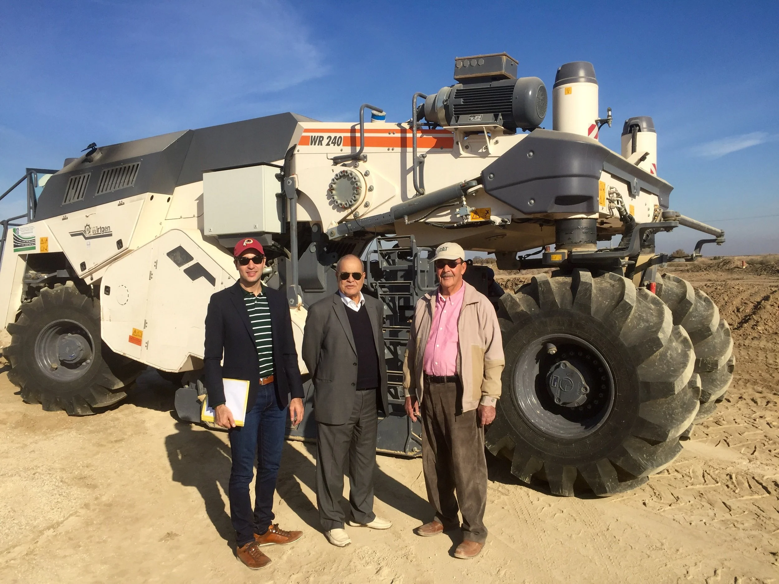
Wirtgen Group builds some of the most technically advanced road construction and mining equipment in the world. Selling that equipment into MENA markets required more than commercial acumen — it required a deep understanding of how geopolitical instability, infrastructure delivery timelines, oil price fluctuations, and cultural approaches to planning shape every purchasing decision a client makes.
My role was to translate between two legitimate but incompatible operating realities. The German manufacturers needed predictable timelines, clear specifications, and reliable feedback loops. The MENA clients needed flexibility, relationship-based trust, and partners who understood that volatility wasn't a failure of planning — it was the environment they were operating in. Foreign exchange fluctuations, currency instability, and unpredictable import conditions added another layer of complexity to every commercial decision, often reshaping deal structures, delivery timelines, and payment terms in real time.
I built structures where both could succeed. By developing a deep understanding of each party's actual constraints — not their stated positions — I was able to identify where the friction was, reframe the commercial relationship, and architect solutions that generated durable partnerships rather than transactional exchanges.
The commercial outcome was €300M+ in revenue generated across eight years. But the more significant outcome was mutual respect — German manufacturers who understood MENA market reality, and MENA clients who trusted that their partner understood their world.
Two moments capture the operating principle.
The first: a client received a defective machine and was being overcharged for the spare part needed to begin operations. I advocated on his behalf directly with our CEO — deprioritizing short-term margin to protect a long-term partnership. The CEO approved the resolution. In that same face-to-face meeting, the client placed a €1M equipment order and secured brand loyalty that extended well beyond the transaction.
The second: operating in extreme field conditions, one of our client's construction engineers identified a structural weakness in a milling machine's frame — a flaw causing systematic and catastrophic machine failure. I validated the observation on the ground, translated it into technically precise language, and escalated it directly to Wirtgen's engineering team in Germany. I framed it not as a complaint, but as a field-validated product integrity issue with systemic implications across the market. The engineering team acted on it. The design was modified. The client's engineer was personally invited to Wirtgen's factory in Germany and thanked by the engineering lead for his contribution. A client became a direct contributor to product improvement at the manufacturer level.
The most valuable intelligence in any ecosystem doesn't live in boardrooms. It lives in the field — in the hands of the people operating the equipment, experiencing the friction firsthand. My job was to make sure that intelligence traveled. Accurately. Urgently. And with enough context that it could actually change something.
Integrity, in complex commercial ecosystems, is not a soft value. It is the most valuable currency available.
The data existed. The insights did not. Through a series of strategic design thinking workshops, I worked alongside Boehringer Ingelheim to bridge the gap between what the research was showing and what the organization could actually act on. The real work wasn't visualization — it was identifying which data points mattered, why they mattered, and how to sequence them into a narrative that changed how the team made decisions.
Working across internal card-sorting sessions and collaborative workshops, I served as the bridge between raw research and actionable strategy. The process required equal parts analytical rigor and human empathy — mapping the mindset of healthcare practitioners based on their daily work activity, energy levels, and stress factors to understand not just what they do, but how they think, prioritize, and engage with information across the arc of their day.
By translating these behavioral insights into a high-fidelity journey map, I enabled the team to pinpoint high-impact marketing opportunities and contextual touchpoints that had previously remained hidden within the data. What emerged wasn't just a deliverable — it was a shift in how the organization understood its audience and prioritized its next moves.
Twenty-four hours. One brief. One team. The objective was to humanize pharmaceutical innovation in a media environment deeply skeptical of the industry. Rather than defending the industry's record, we reframed the question entirely — shifting from institutional messaging to patient narrative. The decision was deliberate: people don't connect with organizations, they connect with stories.
Working within a 24-hour design thinking intensive, my team moved from empathy mapping to a high-fidelity prototype in a single day. The process demanded the kind of clarity that only extreme time constraints produce — every decision had to be purposeful, every element had to earn its place. What emerged was an NPR-style podcast series built around real patient experiences, designed to bridge the gap between the complexity of pharmaceutical research and the human reality of medical impact.
To ensure the work reached the right audience at scale, we engineered a strategic deployment plan through a POLITICO paid media partnership — placing the narrative directly in front of the policy makers, influencers, and informed citizens most likely to shape public perception of the industry.
The end-to-end solution — conceived, designed, and prototyped in a single day — was awarded first place for its narrative depth and technical feasibility. It remains one of the clearest examples of what happens when strategic reframing, human-centered design, and commercial deployment thinking work together under pressure.
Most people don't think about infrastructure until a bridge falls. The American Society of Civil Engineers has spent decades trying to change that — issuing a comprehensive Report Card that grades 18 categories of United States infrastructure on a scale from A to F. The grades are rarely flattering. Stormwater and transit sit at D. Aviation, schools, and wastewater hold at D+. The overall national grade has never exceeded a C.
The challenge ASCE faced wasn't the data. The data was rigorous, comprehensive, and damning. The challenge was making ordinary Americans care about it — and more importantly, act on it.
This platform was built to solve that problem. The strategic objective was clear and directional: educate the American public through a geo-located set of data points and insights about the infrastructure supporting their specific communities, then convert that awareness into civic action — directing citizens toward their local elected officials with the tools and language needed to demand investment and remediation.
This required translating dense engineering assessments — spanning aviation, bridges, drinking water, energy, roads, schools, and more — into a narrative that felt personal, immediate, and actionable. Not abstract national statistics, but local infrastructure realities tied to the communities people actually live in.
My contributions spanned the full strategic lifecycle — from deep-dive research into infrastructure policy to the execution of a comprehensive digital strategy and user interface design. The information architecture was built to guide users from awareness to action: understand the problem, see how it affects your community, know what you can do about it. Every design decision served that directional flow.
The result was a platform that transformed one of the most important civic advocacy tools in the country into an experience that met ordinary Americans where they were — and gave them a clear path forward.
Global investment portfolios don't fail because the data is wrong. They fail because the data is unreadable. USAID needed a platform that could simultaneously serve policy makers, field operators, and the general public — three audiences with fundamentally different relationships to the same information. The strategic challenge was building a modular architecture flexible enough to serve all three without losing coherence or institutional credibility.
Working across a complex information landscape spanning geographic regions, sector-specific investment data, and measurable development outcomes, I architected a platform that transformed raw institutional data into clear, navigable insights. The process required understanding how each audience type approached the same information differently — what a policy maker needs to see first is not what a field operator needs, and neither matches what a member of the public is looking for.
By prioritizing a component-based design approach and high-density information architecture, I built a modular UX framework that allowed users to move fluidly between high-level organizational results and granular project details without losing context. The platform didn't just present USAID's global portfolio — it made the scale and impact of that portfolio legible for the first time.
This web application was engineered to provide transparency and a comprehensive understanding of USAID's global investment portfolio and its measurable impact across the world. The project centered on a high-density information design strategy, utilizing a heavy emphasis on custom infographics to distill complex financial and developmental data into clear, actionable insights.
The platform's architecture leverages a modular UX framework, allowing for a frictionless and highly adaptive user experience. By prioritizing a component-based design approach, I ensured that users could navigate through diverse geographic and sector-specific data sets with ease, effectively bridging the gap between high-level organizational results and granular project details. This modularity not only enhances immediate usability but also provides a scalable foundation for the evolving scope of USAID's international initiatives.
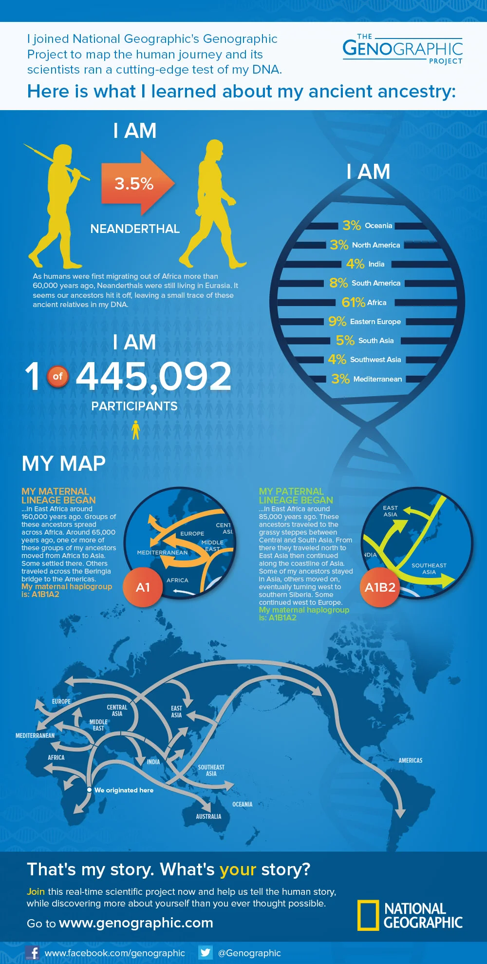
The challenge wasn't design. It was translation. Over 1,000,000 DNA samples, decades of genetic research, and findings that reshaped our understanding of human migration — none of it meant anything to a museum visitor without a clear narrative architecture. My role was to identify the story buried inside the data, determine how a non-scientific audience would navigate it emotionally and intellectually, and build an information system that made the complexity disappear.
Working across vast datasets spanning population genetics and ancestral migration patterns, I distilled decades of scientific findings into a series of high-impact infographics designed for a museum exhibition context. The challenge was sequencing — determining which findings to lead with, how to build narrative momentum across panels, and how to make abstract concepts like DNA migration paths feel immediate and personal to a visitor standing in front of them.
The result was an immersive visual narrative that bridged cutting-edge genetic research and public education — transforming one of the most ambitious anthropological studies ever conducted into an experience accessible to anyone, regardless of scientific background. The work illustrated not just where humanity came from, but how much we share.
The best design problems are the ones nobody has solved yet. This independent concept explored a strategic evolution of the Uber platform into commercial airline services — not as a fantasy exercise, but as a rigorous UX investigation into what seamless end-to-end mobility could look like if a platform with Uber's scale applied its design thinking to air travel.
I utilized my UX expertise to architect a high-fidelity prototype that demonstrates a seamless end-to-end user journey, taking full advantage of the Apple watchOS ecosystem to introduce specialized complications designed for the modern traveler — including in-flight AirPlay entertainment control, real-time geopositioning, and critical arrival data such as ETA and destination time. The experience further integrates contextual utilities like a meal service countdown and destination weather updates. The interface uses a sophisticated dark color palette — a deliberate design choice intended to minimize light pollution and remain unobtrusive to fellow passengers within a low-light cabin environment.
Data without empathy is just noise. This Pfizer initiative required something more precise than a standard healthcare platform — it required understanding the daily reality of living with arthritis, then building a digital experience that met patients where they were emotionally and physically. The strategic challenge was translating clinical credibility into human connection at scale.
I served as a key strategist and designer on this high-profile initiative, delivering an integrated, data-driven experience from concept to deployment. I conducted deep-dive user research and usability testing to translate patient needs into a cohesive digital strategy. My work involved executing the brand design, developing high-fidelity prototypes, and establishing an analytics framework to monitor performance. By prioritizing a user-centric design language, I helped the platform surpass all key benchmarks, including registration counts, blog traffic, and social media engagement.
Commercial real estate platforms have a consistent problem: they prioritize the property over the person. This project for Willow Oaks Corporate Center took the opposite approach — building a digital experience that led with narrative and let the property speak through immersion rather than specification.
The architecture of the site was designed to streamline the user journey, allowing prospective tenants and investors to navigate the property's full value proposition through a seamless, continuous one-scroll flow. To solve the common challenge of mobile navigation clutter, I introduced an anchored vertical mobile navigation — a deliberate design choice that keeps the primary menu accessible without obstructing the site's visual content. By blending this distinctive navigational framework with a minimalist aesthetic, the project successfully elevates the property's digital presence while ensuring that critical information remains the focal point of the interaction.
The most effective advocacy doesn't argue. It reframes. This sponsored-content platform tackled one of the most misunderstood commodities in global health — chlorine — by shifting the narrative from industrial chemical to humanitarian essential. The strategic challenge was replacing preconception with evidence, and doing it in a way that felt credible to a POLITICO readership that defaults to skepticism.
I utilized a data-driven storytelling approach that balanced technical efficacy with human impact. The project involved architecting a digital experience that guides users through the science of disinfection, utilizing clear information design to demonstrate how scalable chemical solutions are integrated into high-stakes global health crises. A central focus of the narrative is the chlorine industry's pivotal contribution to the eradication of the 2014 Ebola epidemic in West Africa, where chlorine-based solutions served as the primary line of defense in infection control and sterilization. By framing the chemical industry through the lens of crisis response, the platform transforms a functional commodity into a narrative of essential public safety and global resilience.
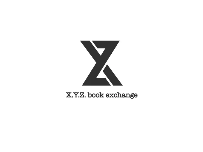
Every identity system makes an argument. This one argued for time, knowledge, and the enduring value of shared ideas — expressed through a single typographic mark.
The letters X, Y, and Z are structurally integrated to form the silhouette of an hourglass — a metaphor for the investment of time required in the pursuit of knowledge. The composition subtly suggests a figure-eight, a discreet tribute to the infinity symbol and the sustainable lifecycle of shared books. The American Typewriter typeface grounds the identity in tactile, historical resonance — a celebration of the American literary tradition. The result is a visual system that bridges abstract concepts of time and infinity with the physical legacy of the written word.